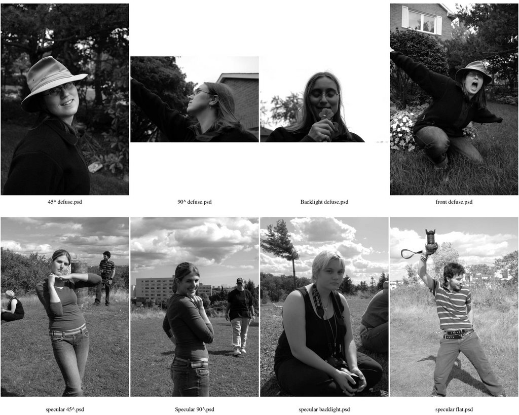
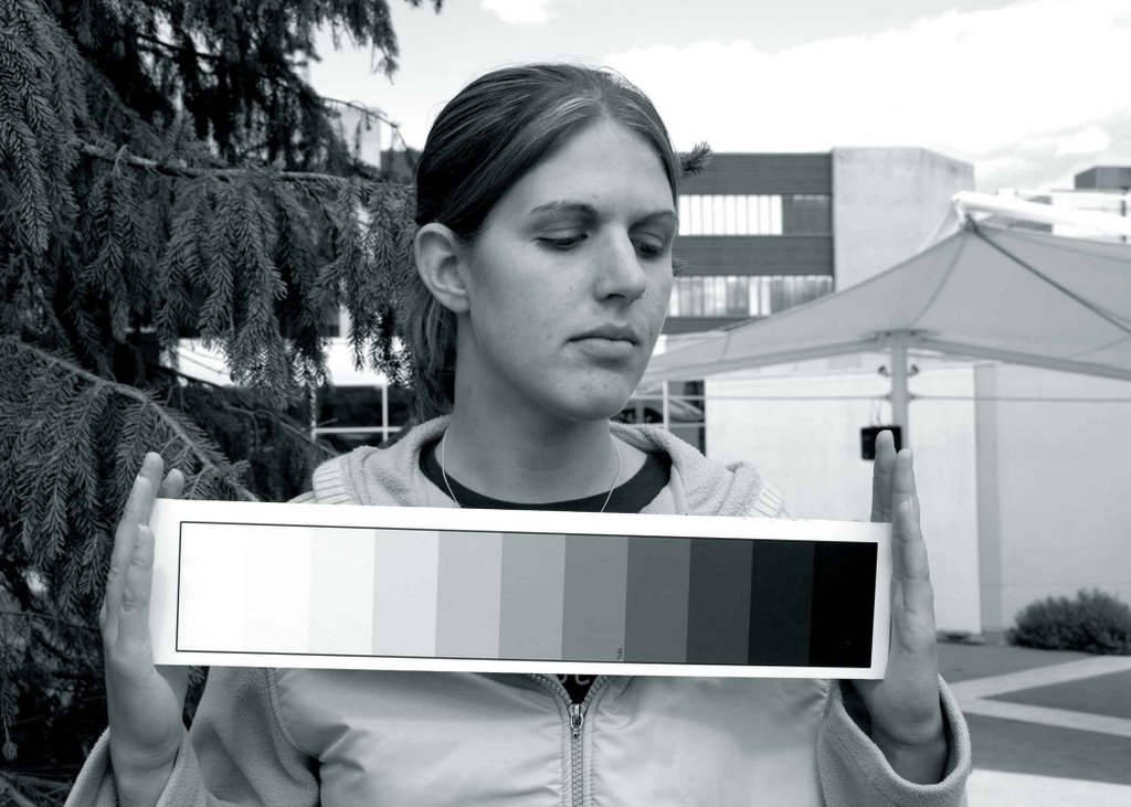
30 October, 2006

Short Lighting

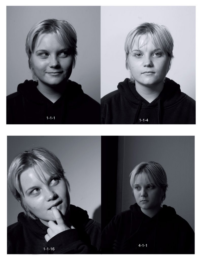
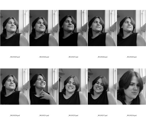
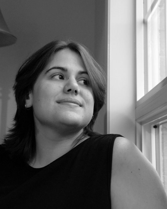
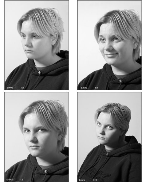
well, this one is very similar to the loop lighting (Partly because we still had to use loop lighting) but for this we needed the subject to have their face turned away from the camera, and we had to light the "Short" side of the face (The side that is away from the camera) and then fill light the "Broad" side of the face with a reflector. and we had to do so with different ratios, 1:2, 1:4, 1:8, 1:16. (those are measurments of how much light is hitting one side of the face versus the other side.) it was fun, Emma is a good model. I hate to think what her pictures look like though! :)

Photoshop Overview


well, this one is fairly self explanitory. this project was just an overview of all the tools and tricks we've learned in photoshop so far. Maybe it is the midterm, he hasnt said as such though. ahh well, easy and fun though! :)

Tethered Texture

Ahhh, I know some of you have been waiting for my next posts with baited breath, and keen aticipitation! (Or at least abit of interest and slight annoyance:)) But it has been mid-term week here, and I havent had many projects come due!... But I did manage to find a couple that I could put up, so here yu go:

This one was for Comercial Lighting class. we had to pick a product, and then arrange it and light it with the goal being to show it's texture. I ran out of ideas so I went to the Caff. and snagged some peanutbutter, and some melba toast! I think it actually worked out rather well...! :)

19 October, 2006

Black Creek Pioneer Village


Ahhh, this was a fun one as well! I had to go on location and shoot a series of pictures of the Poineer Village. we needed pictures of the signs, people that work there, people that visit there, animals, the houses, etc... Then I had to convert and arrange them into a layout for a poster. This is My final product.

Silhouette? (Try spelling that!)

This one was fun! We had to take a picture of a silhouette of a person, and some form of technology. the requirements of a silhouette was that the subject had to be totally back lit, and have no light spillage (well, as little as possible) I ended up choosing a hard one to do with no light spills: very close to a few round surfaces, with some bright light behnd. But I think it turned out pretty good.

Loop Lighting


Well. This was an assignment in portrait lighting, to get us to use loop lighting. (notice the "loop" below the nose) and along with that we had to use different light size ratios. 1:1:1 is when you are framing your subject in your camera at about .5m and are about .5m away from your subject, and when you have a light aprox .5m Sq. 1:1:4 is with the light twice the distance. and 1:1:16 is with the light at lwice the distance again! and the 4:1:1 is with a light about 2m sq. and about .5m away, with a .5 framing. :)
So much fun eh? :) it helps give me an idea of how light works though...

18 October, 2006

Digital Imaging, (Otherwise known as "Photoshop")

These are all images made in photoshop, from various other images, or photos from the samples folder.
This one we were supposed to "design" a bus shelter add, from 3 photos of medical professionals, and a rainbow, and some text. It got us working with layers, and selection tools.


This one was abit more complicated. We had to take this photo of a library and alter it to show what it would look like without power lines, but we also had to adjust the colouring, get rid of the rake, dumpster, garbage, fix the sidewalk, fix the brick, and change the sky.

14 October, 2006

Perspective (s) :)

Ok, this one had to do with lines and perspectives. in a photo, the photographer will use lines and tones to create a perspective. in this first one, I had have a person, and I had to use either a building or a road to create the perspective ot distance or hight or whatever I choose. (I used it to show distance. you can tell she is alot nearer the the end of the hallway.)

And in this next one, I used tone to show distance between the objects in the foreground and the horizon in the back ground. (You can again tell that the objects are closer then the trees, but this time it is because the trees are "softer" and lighter.)

Window Lighting


Many thanks to Erin for her patience! this was kind of a rush job just to get the assignment done. Now that I know more I would like to try this again with some better light, and some different poses... Who knows maybe I will have to! :) anyhoo, this is a window light portrait. it a very soft diffuse light which makes the subject soft and creates a "mood". this one is the contact sheet,
and this one is the final print. I got 70/100 on this assignment.

06 October, 2006

Directional Lighting

Allright, this project was for showing the difference between specular light and Defused light, and what the different angles look like, flat light (where the light is shining directly on your subject) 45^ light is good for portraits. 90^ light is fairly dramatic. and back lighting, again is quite dramatic. Specular light is when the light source is "small" (a speck) and defused light is when the light source is spread out over a large area. *whew* yup it was a fun excercise! :) (Class mates and Jenn helped me with this one..:))

Digital Grayscale


There, this shoot was with the new digital camera. (Requisite for the course, but a NICE camera!! :D) we had to take bracketed shots of a classmate with settings from our light meter, and then with setings from our camera. we then had to find the one closest to "true tone" or 18% gray, and then make a print of it. both my light meter and my camera were off by a couple stops, but it was still fun..:)

04 October, 2006

This was my first assignment with the Mamiya M645super Medium Format Camera. first we had to shoot in the studio the graycard. and then we had to shoot a classmate outside with a grayscale. we had to do "Bracketing" which is when you shoot a series of pictures above and below the settings your light meter says you should shoot at.

02 October, 2006

the "Grey Brick"

here we go! one of my most exciting projects yet!the "gray Brick" this one has to do with ratios. supposedly the contrast between the light and dark sides of the brick, should be 1:2, 1:4, 1:8, and 1:16 in that order. I have yet to recieve my marks for this (or anything really!) so I'm not sure if it's right. but I think thats what I metered it at... :)
tomorow I get to go wonder around a pioneer village and take pictures for a fake poster advertisment. :) as long as the rain holds off it should be fine..! :)