25 April, 2008

Done!

Well all. that is the end of THIS journey. I'm done school, and I'll be moving back to NB soon. I want to thank everyone who helped me, by posing, letting me shoot in their house/work/yard etc, or by supporting me with food, shelter, and any number of other ways that everyone has helped.
The last assignment I had to finish was my website. it is now up finally, and almost the way I want it to look. I plan to keep tweaking it over the next while, and then I'll keep adding to it, and making it bigger and better! :) check it out at:
www.wolfprints.ca
Thanks again everyone, and keep an eye out here for updates on the next stage of my life! :)
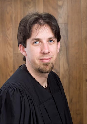


~Gabe

Labels: , ,

Ring gift box


This was the last commercial assignment I had to do. We had to shoot a watch, or something that we showed to him, using back lighting and reflectors or other lights to fill in and create highlights. there was 3 lights for this one, and 2 or 3 silver and white reflectors.

Labels: ,

Annual Report


this is the cover to my annual report I had to make. there were seven more pages to the report, but I'm not going to put those up. :) I went to Philosophers Wool to take photos of the sheep, and the yarn, and the yarn shop. I went to a commercial spinning mill here in Mississauga, and got some factory shots. And I had Jenn pose for a CEO shot as well. it came together quite well I think!

Labels: ,

Character portrait


We are getting toward the end here now. This was a character portrait I had to do. I got my friend at school to dress up all gangstaish and pose for me. :) I like how the lighting worked out on this... coulda had some more separation though.. :P

Labels: ,

Photographers portrait


This is one of the photographers that I interned with. There were two others that helped me out as well. I'd like to thank all three of them for the experiences and for helping me get through my final semester.

Labels: ,

model comp card


This was a model comp card I had to design. A comp card is usually a double sided card (around 5x7) with 3+ photos of the model on it, and contact information and sizing stats sometimes too. This is my friend Joanne who was kind enough to pose for me. :)

Labels: , ,

Glasses


plain and simple. I actually like it though! We just had to shoot the glasses using some certian kind of light, and make it look interestingish.. :)

Labels: ,

Executive portrait


Yes, it's not TOO executive like.. But I efel it met the main requirements of the assignment. Ie: it showed someone in control and in charge of their environment. besides it's a good photo of Dave.. :)

Labels: , ,

Celebrity shot


Do you know who this is?
This was my submission for the celebrity shot we had to do for my location class. This is Stuart McLean from CBC radio. He agreed to meet me at Glen Gould studios for about 1/2 an hr for a shoot. My equipment failed at times, and I lacked an assistant, but I think the whole shoot went very well.

Labels: , ,

Model car?


Yes it IS a model car. We had to shoot a model car in the studio, and composite the different shots that were made for lighting on different parts of the car. The wheels, the rims, the highlights on the chrome, the front of the car etc.. were all different shots.
Then we had to shoot a background to drop the car onto, to try and make it look real.

Labels: , ,

24 April, 2008

Back, done, and a... kitchen?


Yes a kitchen.
This
was an residential interior shoot I had to do. I ended up using the
kitchen that the photographer I interned with had setup in his kitchen.
there was two lights bounced off theceiling, a softbox under the counter, and all the tungsten lighting turned on. (the one over the sink was goboed to prevent flare on the counter.)
On
another note, I have been CRAZY busy the last 2 months, but I am now
done! I will be moving back to NB shortly, and then figuring out what
to do with the rest of my life. I have 9 more assignments to put up
here, so bear with me.. :)

Labels: , , ,

20 February, 2008

Promo Card


this was a promo card I had to make up for entrepreneurship class. I had to show a variety of images that show what I do. I chose to focus on portraiture. I would do a second one if I was going to do commercial images.

Labels: , ,

food shot


this was a food shot that we had to do, using natural lighting, or at least making it look like natural lighting. I baught all the salad items and built and styled the salad myself. :)Looks yummy eh?

Labels: , ,

Business Portrait


this was a business portrait that I had to take on location.
I hauled out my lighting, and setup in his shop before he opened the doors to the public. I snapped this as he was getting the store ready.

Labels: , ,

07 January, 2008

Final exam


This was the final exam for portraiture class. I had to redo my outdoor group shot, and these guys helped me out. I spent a few hrs in Photoshop creating the shadows that make it more of a portrait. this was actually taken with an on board flash.

Labels: , , ,

Beer (or liquid) shoot


THIS one was fun and very difficult to finish off right. there was a lot of Photoshopping afterward to make the bottle pop just right. and during the shoot there was 4 photos needed: one to light the props right, one to light the labels right, one to light the liquid right, and a mask so I could separate the bottle from the background. for me, lighting the liquid was the hardest, bcause I had to remove ALL the props (including the sand!) and keep the bottle in the same position, and then light the bottle from behind. I dropped a ocean shot in behind from this past summer in Alma.
(And yes I enjoyed it afterward as well! :) I had saved this schooner since Aug. just for this shoot!)

Labels: , ,

Low Key Portrait


This one I thought turned out much better then the I was graded for, but ahh well. :) this was a low key portrait. it had to be darker colours on a black background. I used about 4 different lights to create the highlights needed to separate the subject from the background.

High key


This wasn't my personal choice for the best photo of the shoot, but it was the one that matched the assignment the best. (I thought)
The assignment was for a high key portrait, that was full length. nothing in the photo could be darker than skin colour, and on top of the I had to light so that the floor was white as well, and there should be no shadows.

Labels: ,

Electronics shot with movement


This assignment was to shoot a piece of electronic equipment in such a way as to imply movement. We could do this in the camera if we wanted, by dragging the shutter and having a tungsten light source on the background. I however opted to create it in photoshop. it took a supprising amount of work to make this look like this.

Labels: ,

indoor Family shoot


This assignment was to shoot a family of 3 or more indoors using controlled lighting, but on location (not in the studios) and create a group/family portrait.

Labels: , ,

Time shoot


this one was to shoot a timepiece in such a way as to have a sculpted soft highlight, with a harsher specular shadow.

Steamwhistle Brewery


This was a location shoot we did at the Steamwhistle brewery in downtown Toronto. it was rather fun. you can see in the top left corner where they are in relation to the sky... uh.. Rogers center.

Labels: ,

Restaurant shoot

This one was fun. I had to go contact a restaurant to get them to let me shoot during a time when they were closed. I actually found a place called Gabriel's Place, which worked out wonderfully, and had this great interior!

Labels: ,

Transformation


This one is an example of some of the things I've been doing in photoshop class lately.. there is a lot more I have been doing, but I lack some of those examples.. :)

yes, I know...

Well... yes it IS 2008... Maybe it IS time to update this blog eh? I suppose I should get all these photos up before I start into this last semester. :)

well I'll start out here with my editorial location shoot. this was taken at a local drive-in near Mississauga.

Labels: ,

28 October, 2007

Markings


Well this was a theory assignment. I had to create a Magazine cover, for "Markings" a body modification magazine. and then I had to print it off in RGB (Red/Green/Blue), then convert it to CMYK (Cyan/Magenta/Yellow/black) and print it, then convert it back to RGB and try and get the colours back.
the printing part I'm not sure if it worked out right... But I like how the cover turned out! :)

Labels: , ,

Cosmetic Shot


This was a basic commercial shoot. with some fancy lighting. We had to use one main light to light everything. Then we had to light for each of the items in the shot: defused lighting for the shiny surfaces, specular highlights to show textures, etc etc.. I had 4 lights, and 2 reflectors for this.
Then we had to close crop the whole thing in Photoshop, and drop it on a made-up background.

The Family Shoot


This was a fun assignment. I had to take a picture of a group of people, at least 3, and try different poses.
We tried some different classical poses first, but this is difficult to do with little children who have lots of energy! (especially if it is colder, ad outside..)
so we started into some different stuff.
This one was the best expressions from everyone! :)

Labels: ,

Cyanotype Print


... (Or otherwise known as a blueprint)
Hey there everyone! Just some quick updates. this is my cyanotype print I had to do for my history and design class. this was one of the first processes developed in the 1840's, and it has been in use up until the few years as the "blueprint".
along with being fairly old, and the most simple process, it's also one of the safest. (as long as you don't accidentally heat up the Potassium Ferricyanide over 300^F, or drop it in some form of strong acid, you are fine. it is used at room temperature and mixed with Ammonium Citrate. simple!)
this is the print I made from the digital negative mentioned earlier.

Labels: ,

17 October, 2007

". . . when I'm 65."


Hi!
well, I had a lot of fun with this one.
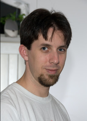
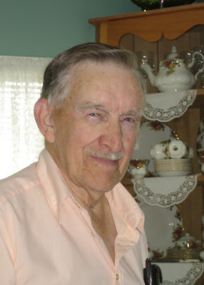
this here is me. I had to take a photo of myself, and a photo of my father, and try to make myself age at least 20 years.
In my case I didnt have any easily accessable photos of my Dad, I DID find a photo of my grandfather though.

Once I found this one, I tried to match the lighting as best as possible. the on camera flash was easy; however, the light from the window was a little trickier. I decided to do what I could with a second flash bouncing off of the drawn blinds. Once I got the photos, it took me probably 6 hr's of photoshoping to match, blend, blur, and clone in the necessary bits to create this!
this is me in about 40 years.. :)

Thanks go to a great grandfather, and good genes.. I couldnt look this good without them.